
Newsletter #010
My 3 Color Guides
Hello and welcome back!
Woooaahh! Double rainbow all the way!
We’re talking about colors today. Specifically what I like to refer to when I’m picking out a color palette for a data visualization, website, or anything else that has a design process around it.
As a data analyst, I think it’s integral to design something readable and appealing for my audience. The resources below will help you pick the best colors for whatever you may be designing.

1 - 60:30:10 Rule
First things first, let’s learn a very basic design rule. The 60:30:10 rule.
tl;dr, You want 60% of your design to be a light color that can be used primarily as your “white space”, 30% that is the main accent color, and 10% as a highlight color.
There are a lot of videos explaining this concept on YouTube, I just like the one that I’ve linked as it’s short, and explains the concept well with various examples.
So the next time you are working on a figma, slide deck, or visualization. Know your 60:30:10.
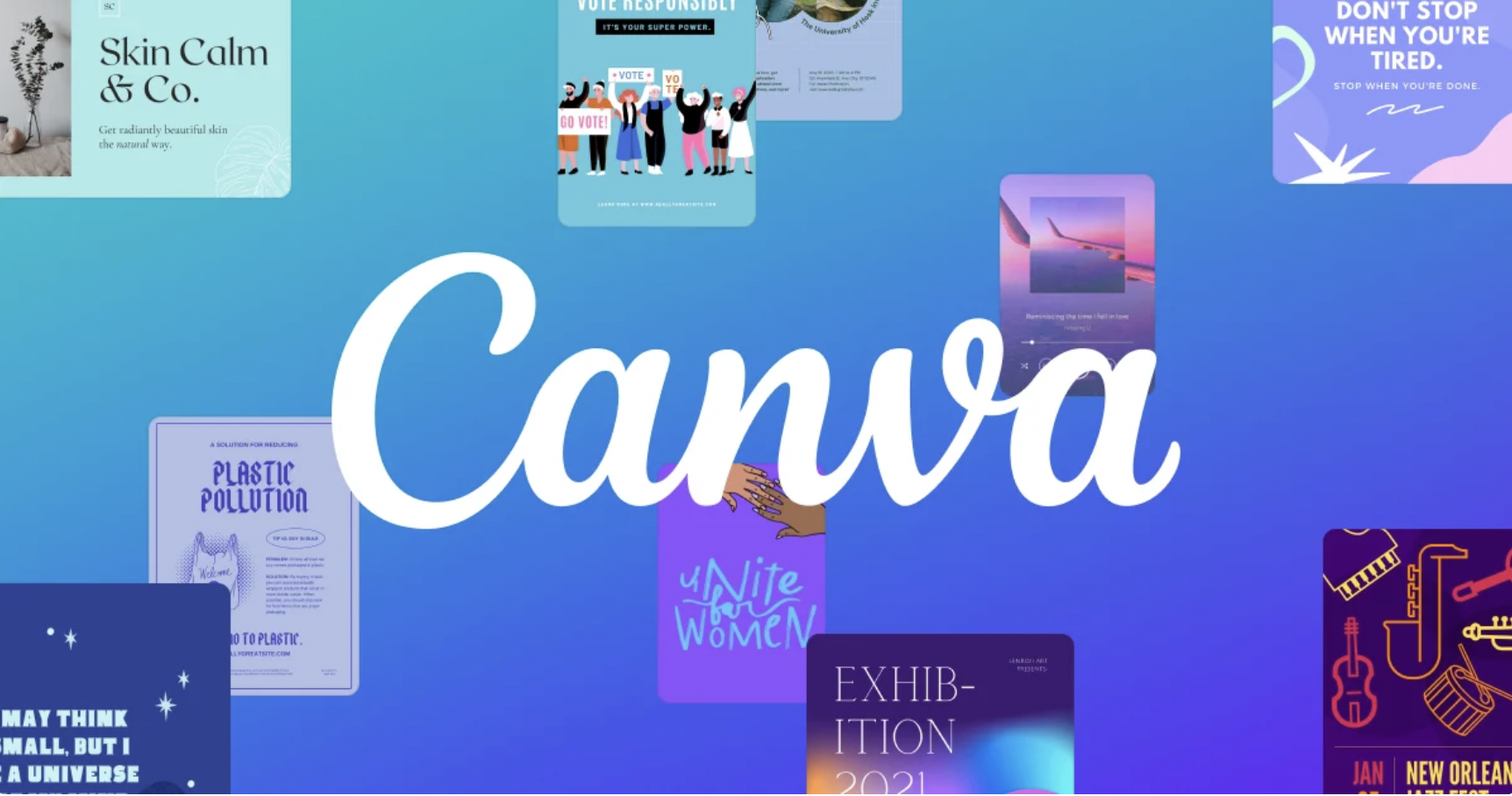
2 - Canva Color Wheel
So you got your design colors, from the video above, but you’ll need more than that depending on what you’re designing.
Let’s say you’re making a scatter plot or a line chart where you want high contrast colors, that matches with your color palette. This is where the Canva color wheel comes in handy.
You can use the wheel to get complementary, analogous, and triadic color patterns to go along with your main design palette. Don’t know what those words mean? No worries! The site explains them all and then some.

3 - Color Space Palette Generator
I’ve shared the web app coolors.co in a past news letter that helps you generate a great color palette by starting off with a single color, but I also wanted to share another that adds a little bit more flavor and greativity [that’s great and creativity combined, I know how to spell ok?].
Color space takes you one step further by helping you create gradient color palettes that can be used for bar charts showing progression, uniquely colored heat maps, or even just for a great background styling.
Yes, I put quite a bit of emphasis on colors in this newsletter, but remember, your data is only as good as your ability to capture your audiences attention, and color goes a long way here!
If you were forwarded this newsletter and would like to sign up, just click the link HERE.
Thank you and be good,
Irfan - Founder