
Newsletter #012
My 3 Favorite Visuals Pt. 2
Hello and welcome back!
The creative world is amazing. When I was younger I would think,
“Who cares about art, buncha worthless doodles.”
- me. circa 2005
I guess I was just looking at the wrong pieces of art. Data represented as a story is a piece of art to me, and I have a high level of respect for those who do it well.
Below I share three more of my favorite visual data story telling from across the web.
As you go through them think about how well they represent their story. How was the information organized and delivered to you.
Hopefully you’ll be as delighted by these as I was.

1 - The New Normal
This simple, yet extremely effective, visual tells us what is the “new normal” based on Google search trends from 2019 to 2022. Notably, before and after March 11th, 2020; when the World Health Organization announced COVID-19 to be a global pandemic.
The visual splits out Google search trends into three categories:
The New Normal: Search interest that increased and stayed high during and after the pandemic.
Unusual: Search interest that peaked during the pandemic, but has since returned to normal.
Normal: Search interest that hasn’t changed before, during, or after the pandemic.
There’s some obvious spikes that occur such as “masks” and “baby wipes”, but then some that just don’t make sense (at least to me that is), like “rocks” or “elastic”.
What’s great about this visual is how simple it is. The use of a white background and three primary colors are used extremely effectively to show what people were looking into during the pandemic, and how that has changed our behaviors overall, even after the pandemic has subsided.
What can you dig into at your company to see what behaviors have changed due to the pandemic?
2 - WeTransfer Ideas Report 2021
This presentation hits all the visual notes;
Bold, simple type-face.
Clear separation and indication of sections.
Great use of colors.
Clever use of gradients for charts.
I like using decks like this as an inspiration of my own decks. I love the simplicity, and I believe it imparts the story in a much more consumable way.
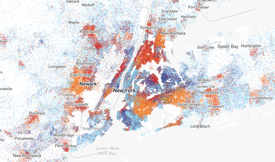
3 - Race Census
This dot plot map of race and ethnicities across the US is pretty neat. Each dot represents a specific race or ethnicity.
I love how if you have a good collection of data, you can create something so beautiful and informative.
Try checking out different major cities, it’s interesting to see distinct patterns of how racial groups are divided, and how they are mixed in.
Getting this level of data fidelity can be difficult, but if you are able to get it, the flexibility of what you can create is only limited by your imagination.
Strive for high data fidelity, and then we can all have fun with these types of charts.
Pretty charts, graphs and presentations are always fun to look at, but there’s a lot more we can take away if we think about HOW they put the presentation together, and HOW they conveyed the story in such an appealing matter.
If they can make beautiful stories, so can we.
If you were forwarded this newsletter and would like to sign up, just click the link HERE.
Thank you and be good,
Irfan - Founder