
Newsletter #005
My 3 Visualization Finds
Hello and welcome back!
Data is great, I’m sure we can all agree, but what’s the use if we can’t interpret it? Visualizing data is the sauce to the metaphorical lasagne. Below are some of my favorite visual interpretations of different data points. A lot of them are interactive to help you dig in deeper. I find these kinds of sites fascinating!
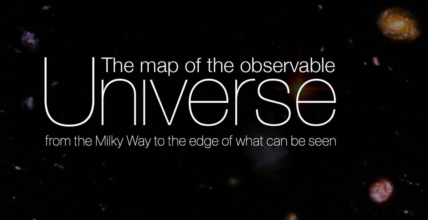
1 - Map of the Observable Universe
How big is the universe? How far does it go out? This site helps map out the vastness and expanse of the universe in a way our tiny minds might be able to comprehend.
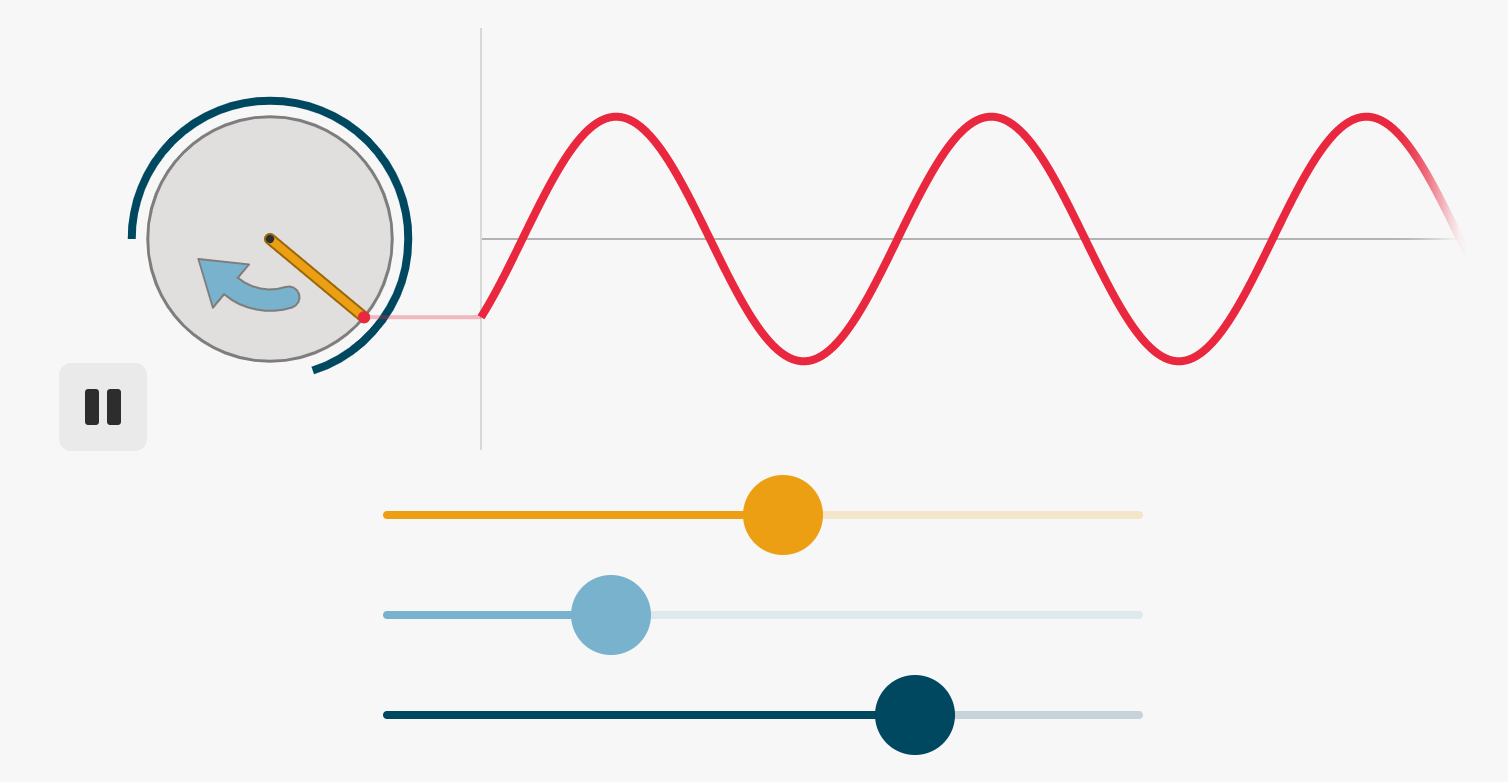
2 - Visualizing Sound
It’s difficult to understand something that you can’t see or interact with. This interactive presentation on all things sound by Bartosz Ciechanowski is a simple and effective way to understand how sound interacts with the world around us. The interactive visuals are fun to use and really helps visualize the concepts.
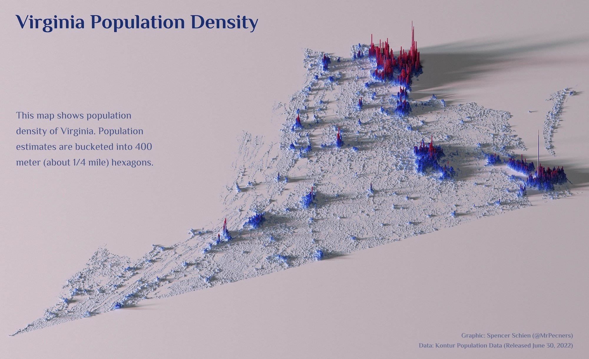
3 - Population Density Visualized
A beautiful visual isn’t just impactful, but makes it a piece of art to awe. The way population density is shown on this site by scale of the bars across the expanse of a state helps to instantly understand the message being conveyed. I want one to just print out and hang on my wall!
What did ya’ll think of the visuals I shared today? What do you look for when creating a visualization or looking to receive one? Feel free to email me to share. Would love to hear your thoughts :)
If you would like to sign up for the newsletter, just fill out the short form below.
Thank you and be good,
Irfan - Founder